Thursday 1 December 2011

A Day Beside the Seaside - Card and Gift

For my card and gift project I decided to look at the seaside. I went to the beach and took photographs of things like fish and chip kiosk's, ice cream vans, donkeys, rock, etc. I then started to draw from my photographs.


On my drawing sheets i used a lot of mixed media such as inks, dyes, paints, pens and also fabric. I experimented with adding techniques together using different weights of line, screen washing text onto my pages, collaging papers together and also stitching fabric onto some of them.

These are just a few of many of my drawing sheets but these are the ones I like the most. I was very happy with all of my drawing but there is something about these pages that really stand out to me. I think together with the colours and the line drawings it makes the pages look quite quirky.


This is one of my card designs. With it being a seaside theme i kind of wanted a postcard feel to it as well. I made this card by layering my motif of an ice cream van on top of each other making the image smaller each time. What do you's think of the worker???


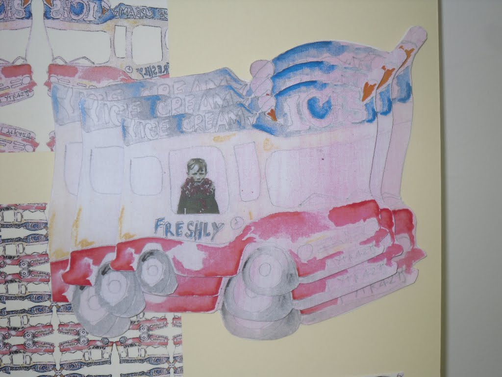
Not that i have very good making skills (even with paper) i wanted to make all of my cards 3.D where possible. For this design i used the same image twice and cut all of the windows out and tried to make it look like a circular kiosk. I am happy with the design of this card but i think it could be made better and look more professional. Does anyone agree?


For this card I wanted to create a scene from the seaside. So once you got past the shops and kiosk's you see sand, sea, deck chairs etc. To try and do this i made the front of the card the fish and chip kiosk but once you opened it up there is a pop up scene from the seaside. Again with this design i think it is a good idea but not made as well as it should be. What do you think?

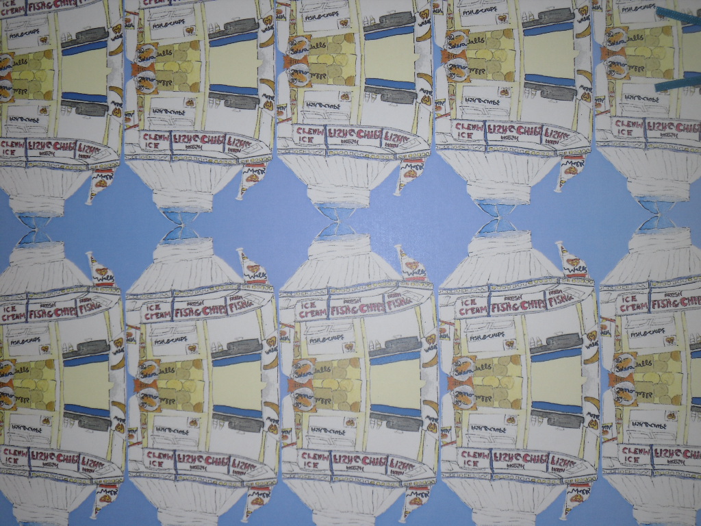
These are my gift wrap ideas to match my cards. I designed them using photoshop and using techniques such as flipping and rotating images and repeating them. I think my gift wrap designs have worked out quite successful and i really do like them.


These are my final product boards where i have included my cards, wraps and also added matching gift tags. I think my boards are very neat and tidy and look to a professional standard. I am very happy with what i produced.

Please feel free to leave any comments or suggestions. Thank you.

All Images Copyright @ Stephanie Quinn

Tuesday 18 October 2011

Changing Background

Can anyone please help me???? I am trying to use my own design for the background of my blog but i don't have the foggiest on how to do it haha Does anyone know and can tell me pretty please? xxx

Male Fashion...

For my second project I decided to attempt to design t-shirts for men. my theme was really all about everyday objects which were related to men.
These are a few of my drawings from this project. Most of my drawings are line drawings or quick sketches using different techniques such as blind or continuous line. This is because I am not a very confident drawer and feel happier using these techniques. For the colour scheme i wanted to go quite retro and I think with the colours and drawings together I have achieved this.
This was my first t-shirt design which went completely wrong :( I stupidly exposed my screen the wrong way round and my text printed backwards. for this design i was trying to create a modern placement print and from my research i found a lot of men's t-shirts had slogans and text on them. From the moment i started this t-shirt i didnt like it but i carried on regardless... printing and then stitching into it using hand and machine embroidery.
This is another design which i dont really like lol i was trying to create a modern t-shirt with a retro feel but i think the colours turned out a bit bright. The sauce bottle still gives a little retroness to it but i dont think it works as well as it should lol. I took big inspiration from Andy Warhol for this deign. I also machine stitched around some of the boxes to give a patchwork effect and used free hand machine embroidery within the design. A few disasters within this project so far lol.
This i think is my most successful design from this project. I love the bright colours against the black background and i think that it is quite a quirky design. The motif is taken from my drawing of the wires from a male shaver which i have repeated and screen printed down the sides of the t-shirt. I have also added foils and hand embroidery (satin stitch) in certain areas. I am really happy with this design and i think that it could be quite commercial.

Hope you like this project and feel free to comment good or bad... or even suggestions for improvements. xxx

All Images Copyright @ Stephanie Quinn

Saturday 7 May 2011

Very Annoyed

I am getting extremely irritated as my blog wont let me upload any pictures to it!! Three days in a row this has happened now!! Does anybody know any solutions to fix it lol xxx

Saturday 30 April 2011

Roma Interior Surface Design

drawing


My first project this year was to create a design for an Interiors Furnishing Fabric. I decided to choose the theme Roma and I started to mainly draw skulls and roses using different techniques and media. When drawing I tend to use blind drawings and continuous line drawings as I am not 100% confident with my drawing skills. I also sometimes prefer the way the quick, loose styles look. In these drawings I have used a lot of watercolour and Acrylic paint for the striped backgrounds.


This is my final design for my furninishing fabric. I have took the drawing of my skull and repeated it all over in circles and painted it with watercolours. Even though this design took me about a week to complete I am extremely happy with it. I think it works well and is one of my most sucessful designs.

This is my first fabric sample which I have tried to match up with my paper design. This was alot easier said than done!! For this screen print I used pigment inks and foils. Although I do like it, I think that the paper design is far better and looks more sophisticated!

This is my sampling of variations of my final design. This was the very first time I had used ordinary and illuminating discharge and I am rather pleased with the results. The skulls are printed using plain discharge and the roses are printed with a yellow illuminating discharge and printed onto black cotton. I think my design looks quite scary in these colours but I do enjoy it.


 For this third Print I decided to try out flocking which was very messy! The skulls I have printed using flocking glue and then added grey flock over the top. I have also used gold mettalic ink and pigment inks printed onto a hand dyed fabric. I am not really happy with this sample as the metallic binder blocked my screen which made my print turn out uneven :-( The flock was also messier than i thought and didn't give as much detail in the skulls as I would have liked it to.


Ooooo I was really suprised at how much I like this print. It reminds me of a tattoo design a little. I used pigment inks and gold metallic and printed onto a black cotton. I think this is my favourite :-)


This is my final collection mounted onto boards. Overall I am really happy with my design but I still prefer it as a paper design rather than printed fabric. Please feel free to comment your thoughts or suggestions :-) xx

All Images Copyright @ Stephanie Quinn

Numero Uno

Hi Everybody and welcome to my blog! I have eventually got around to making my first post and there shall be many more to come. I will be using my blog to put up images of my work and talk about my most recent projects. I hope you's all enjoy :-) xx